skip to main |
skip to left sidebar
skip to right sidebar
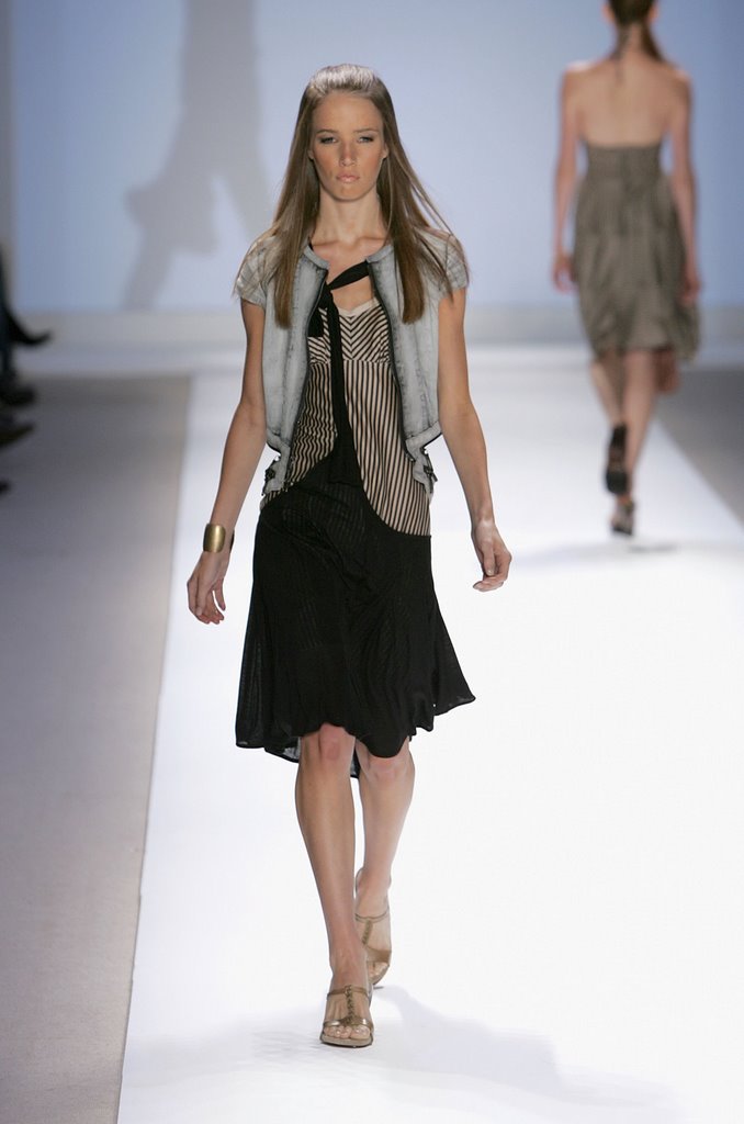
 As far as we're concerned, this is how it should be done. It's still Jeffrey, still very now, but it's clean and it looks good on a woman's body. The proportions are perfect, the cut is stylish and the bag looks great. One of our favorites.The judges didn't seem to like this one, but we did. The color fits with the rest of the collection and it's got that patented Sebelia "ugly/pretty" thing going on, which he does well. Yeah, it's a little too deconstructed for our tastes and it has at least one too many elements to it, but overall, we liked this.This, on the other hand, is just plain ugly. The fabric, the color, the construction - none of it works. It's totally unflattering to her body and there's just way too much going on. An empire waist with pleating? And a ruffle? AND a layered hem? It's like a Sewing 101 project.
Oy. We're not going to mince words here, this was HIDEOUS. The fabric is ugly, it looks poorly sewn, the proportions are all way off and the overall effect is "bleh." Look at all the puckering in the trim around the collar. And the trim around the waist is crooked.And sorry to say it, but that model was awful. She had absolutely no idea how to wear the clothes or walk on the runway.
Another one we liked. "And the Beat Goes On" meets "Mystery Achievement." Jeffrey's not innovative but he reimagines certain looks very well. We don't love the lawn chair fabric, but there's no denying that's a beautiful and beautifully made jacket.
Credit where credit's due, this is an absolute stunner. As we said, we're not crazy about the fabric but it totally works here and helps to highlight the masterful construction of this piece. The use of the zippers, the way the skirt creates its own pockets, and the way he used the stripes to highlight a woman's body (as opposed to hiding it or fighting it like he sometimes does) combined to make this one of the most memorable pieces out of all four collections. Marilinda looks adorable in it and she rocked it, but that "left my sunglasses on by the pool" makeup is awful.
As we said previously, he would not have been our choice for the win but that doesn't mean we don't think he deserved it. Frankly, "innovative" is a bullshit criterion for evaluating a collection because fashion is almost always variations on a theme, with true innovation being so rare (and in the end, relatively unimportant) that it's almost not worth mentioning. No, this collection wasn't innovative; it was risky, and THAT is absolutely a valid and expected criterion for judging a collection and from that angle, he definitely was the clear winner.
Who do we think should have won it? Well, tomorrow we're going to judge the judges and we'll let you know then.
[Photos: FirstView]
Post a Comment
 Out of the final four, it was Jeffrey whose collection made the strongest statement. The show itself was somewhat anti-show. The music, while beautiful and haunting, came off at times as downbeat and morose and the models couldn't walk to it at all. The styling was a little bleh and the shoes were downright ugly.What it lacked in showmanship, however, it more than made up for in risk-taking and cohesion.Let's start the show.God, those shoes. They wound us. Probably not half as much as they wounded her, though.
Anyway, we'll start off by saying this fabric was plain ugly. In fact, Jeffrey almost always makes fabric choices we hate. We're not a big fan of all the extraneous strappy/hangy stuff, but the proportions work and the dress as a whole makes an impact, if an understated one.
Really, really hate the proportions here. That looks more like a foundation garment than a bathing suit. It is a bathing suit, right?
The jacket and bag are nice, though.
Lorenzo loved it, Tom hated it. Lorenzo thinks it looks young, pretty and delicate. Tom thinks she looks like Strawberry Shortcake.
We have to say, this really grew on us. Yeah, it's a little gimmicky and we question who would wear it, but there's something about the color and proportion, the careful sloppiness and planned asymmetry of the straps. It just works. Great pants too.
This one did not grow on us. We liked it on the rack when he showed it to Tim, but it got seriously ugly on a model. For once, we love the fabric, but we hate long-in-the-front hems. It always makes her look like she's wearing an apron. The dress looks deceptively simple but if you blow up the pic, he constructed the hell out of that thing. Too much so, in our opinion.
Love the jacket. The little capped sleeves and the open-zippered back look new and different. The skirt is great too, but this whole "tied together" thing has to go. He had the beginnings of a perfectly good design but that "uni-suspender" is distracting as hell. And pointless, to boot.
[Photos: FirstView]
Post a Comment
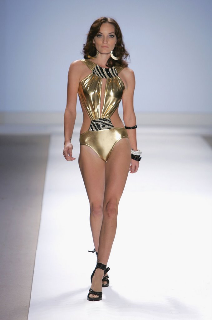
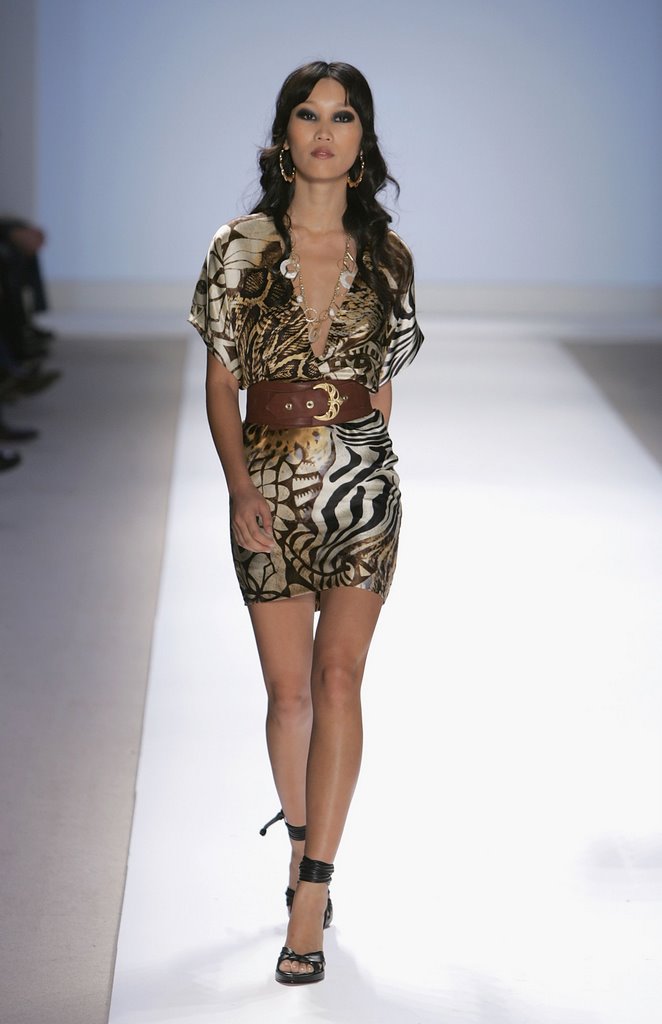
 This collection is getting shinier with each outfit. Ignoring the color and fabric choice, which is of course nigh-impossible, we still don't like this one. The proportions seem off; belt too thick, waist too high, pockets in weird places. Just not working for us on any level.We'll say one thing, that is one striking model. They had to Zamboni the runway to clean up all the attitude she splashed around.Whither art thou, Pam Grier? There can be no better example of the difference in Mychael's work when he has guidance, because this is nothing more than a cheap knockoff of a much finer piece he did on a much lower budget.
Good god.We don't even know what to say about this one. Tacky, too-tight in the wrong places (hello pelvis!) and just bad, bad bad.
This isn't bad. Like every other piece in the collection, there's too much going on but we like the proportions, the belt's not bad and the styling works. It's still hooker, mind you, but it's toned-down hooker.

 This is at least less offensive than the other bathing suit, but if you've got something you want the model to take off on the runway, don't give her a big honkin' bag to carry at the same time. She looks like she's fishing for her room key.

There's nothing wrong with sexy or even hootchie as the focus of a collection. Like everything else in fashion, it works if it's done well and there's real thought and expression behind it. We have no doubt that Michael really thought about it, but we think he's got some growing to do before we really see what he's about. This was too young, too raw, and just not sophisticated enough. Like all four of the finalists, he's a major talent with a future ahead of him but not everyone can get it right on the first try.
[Photos: FirstView]
Post a Comment